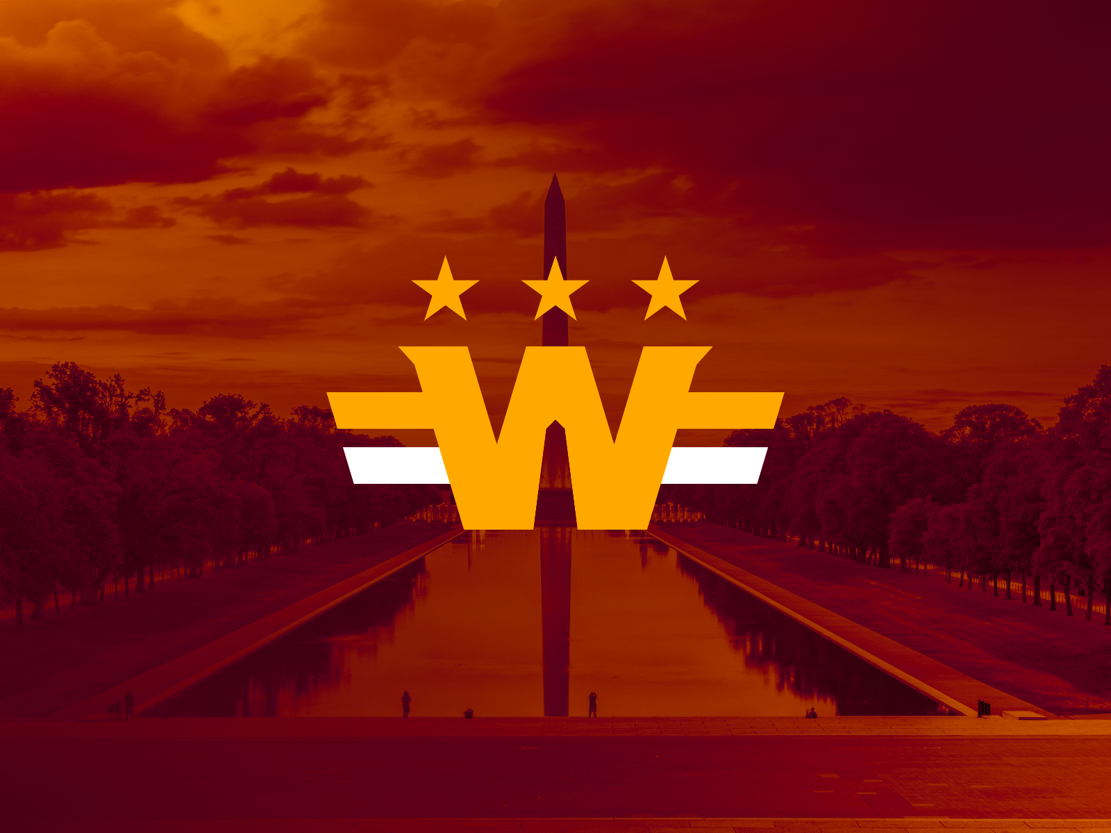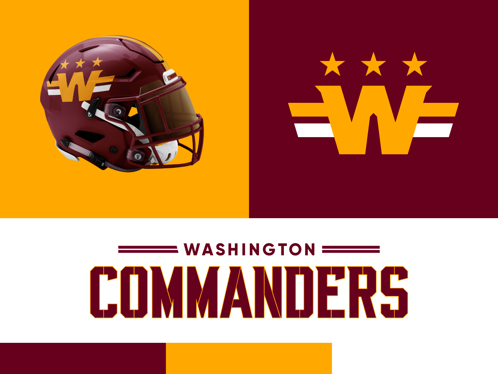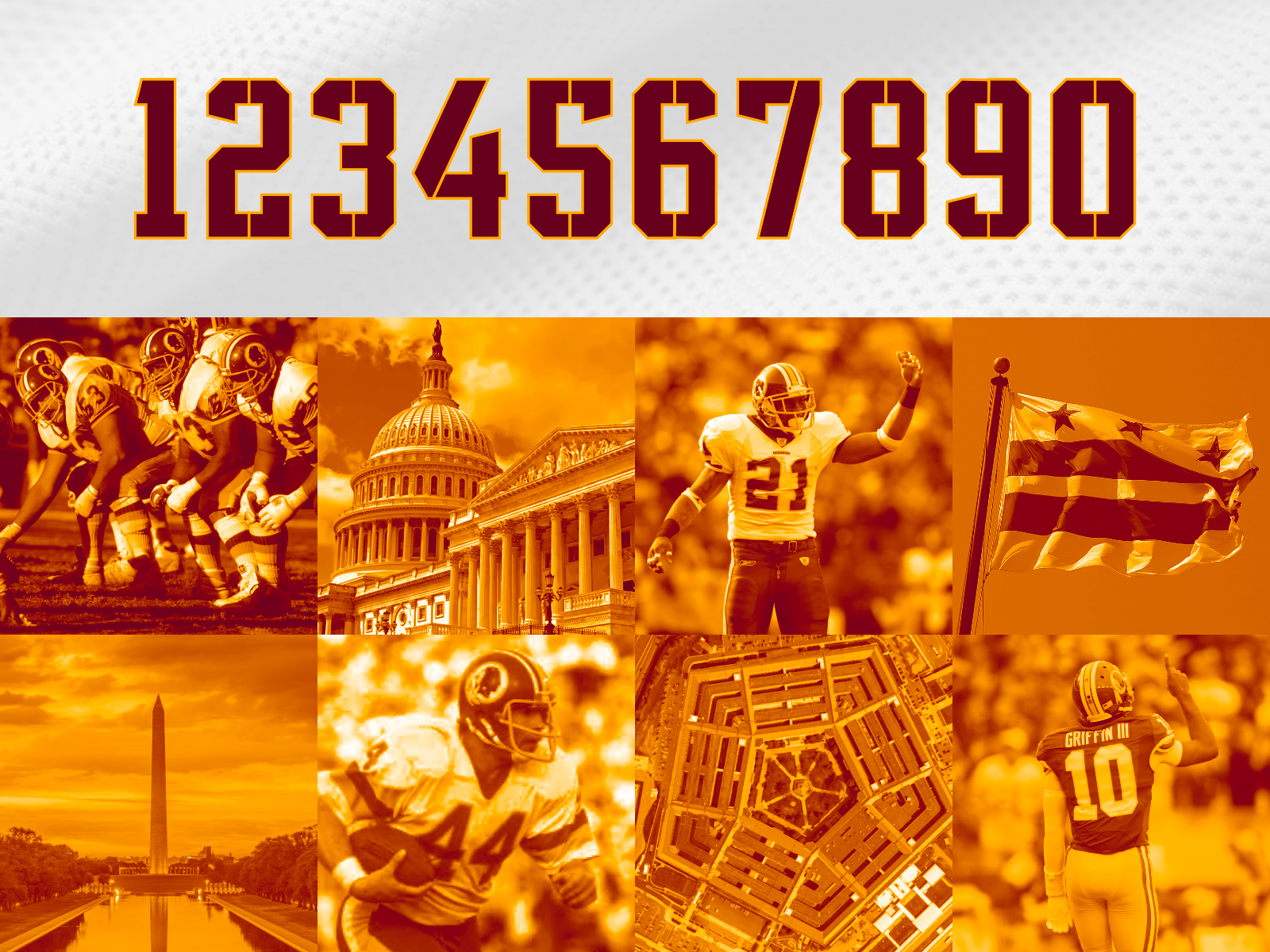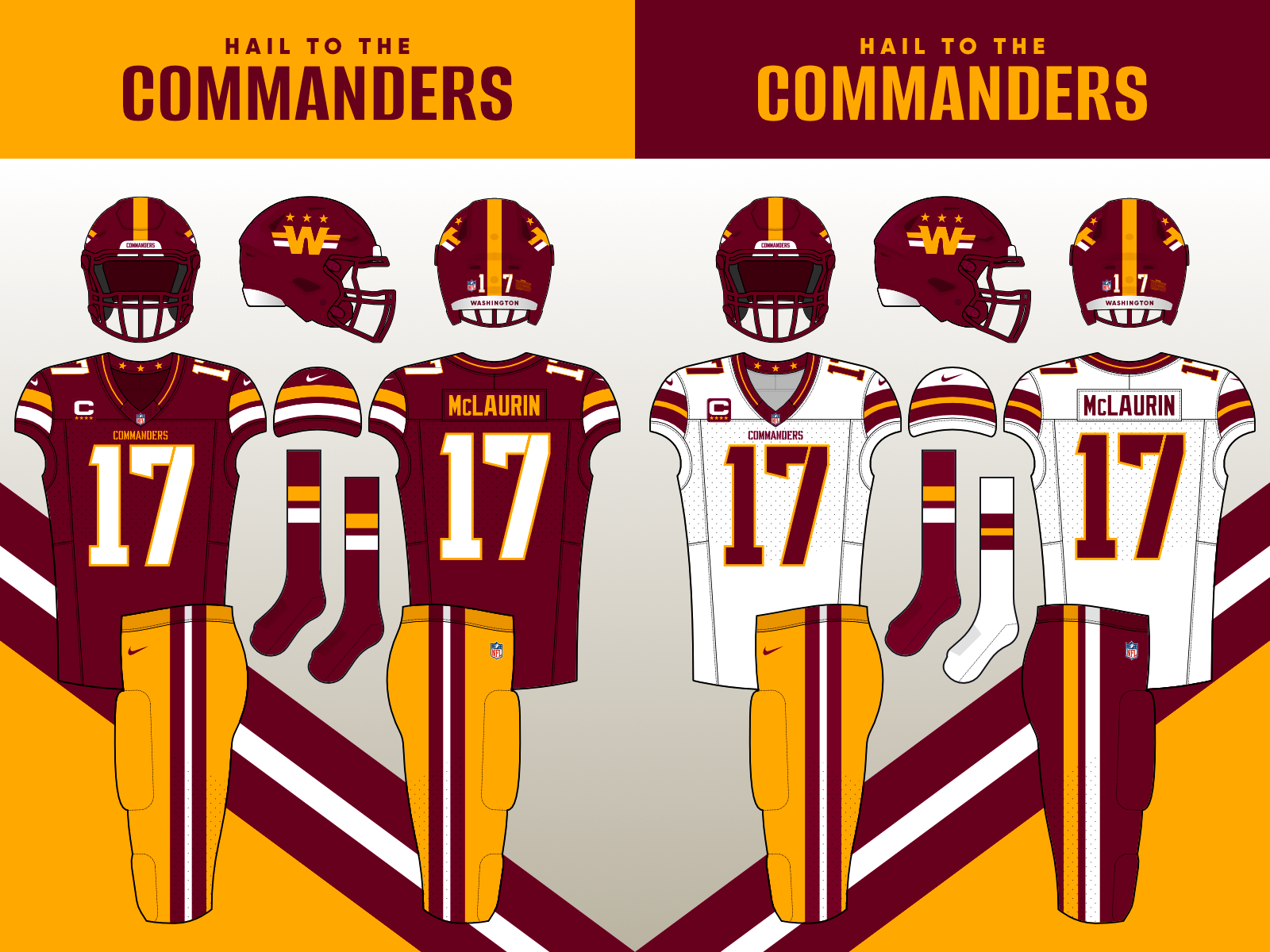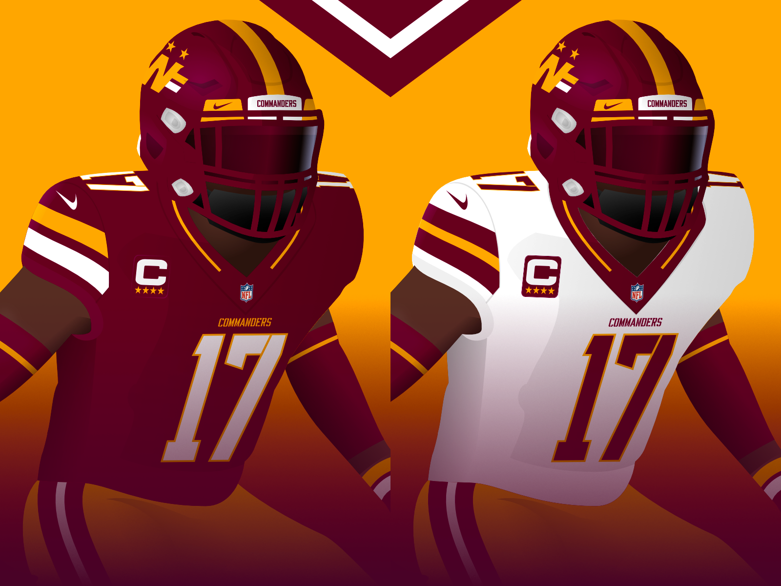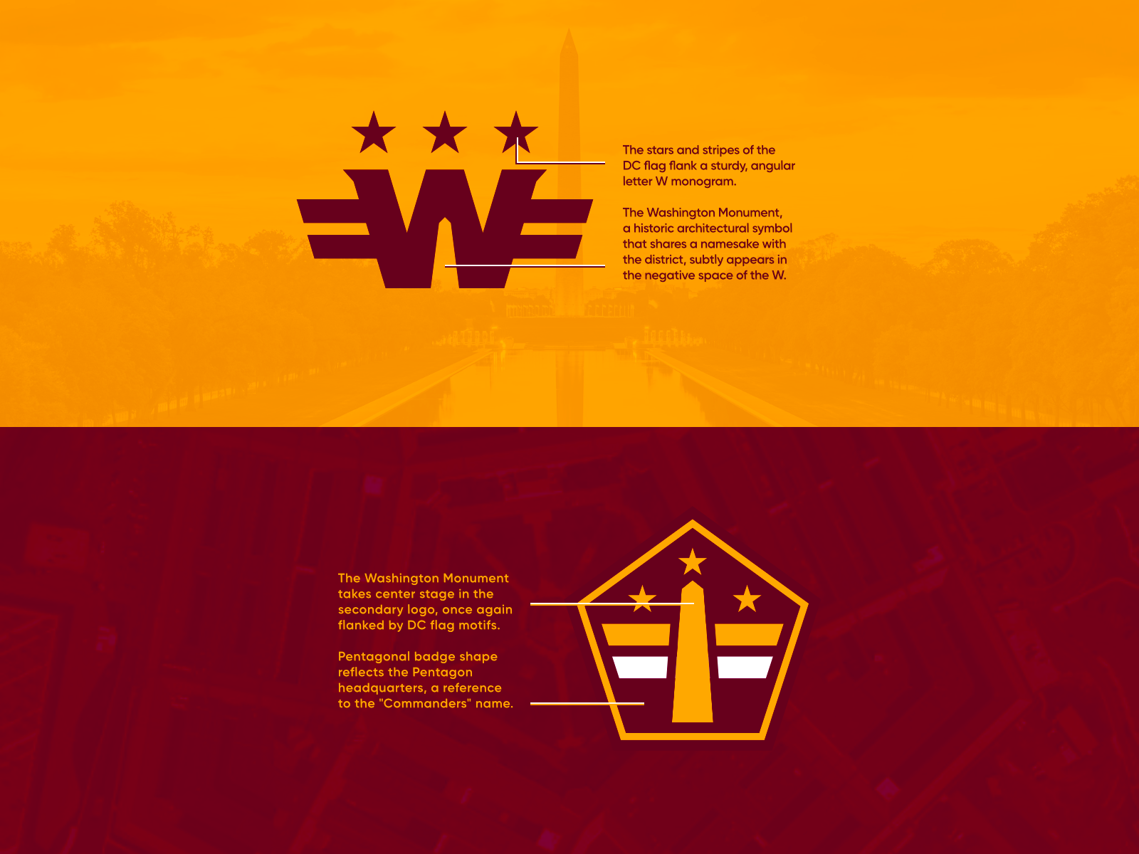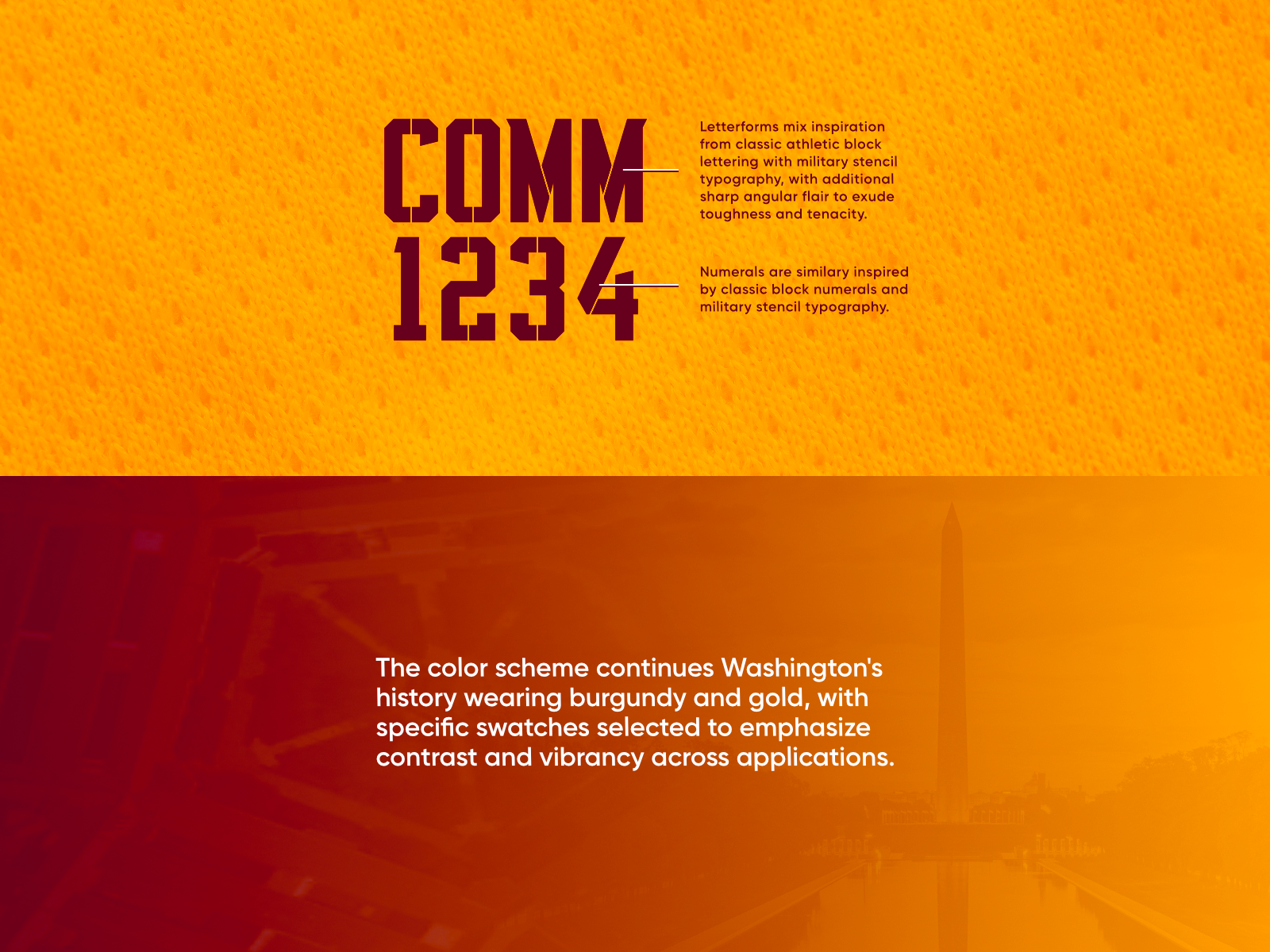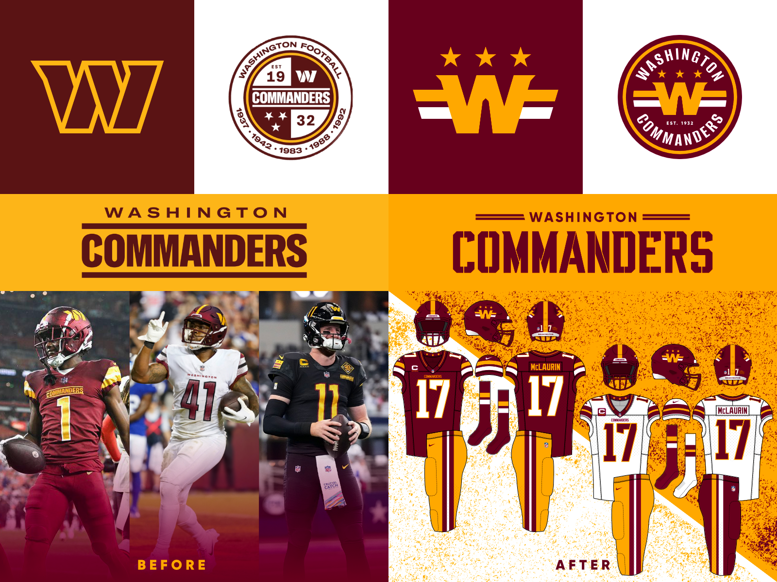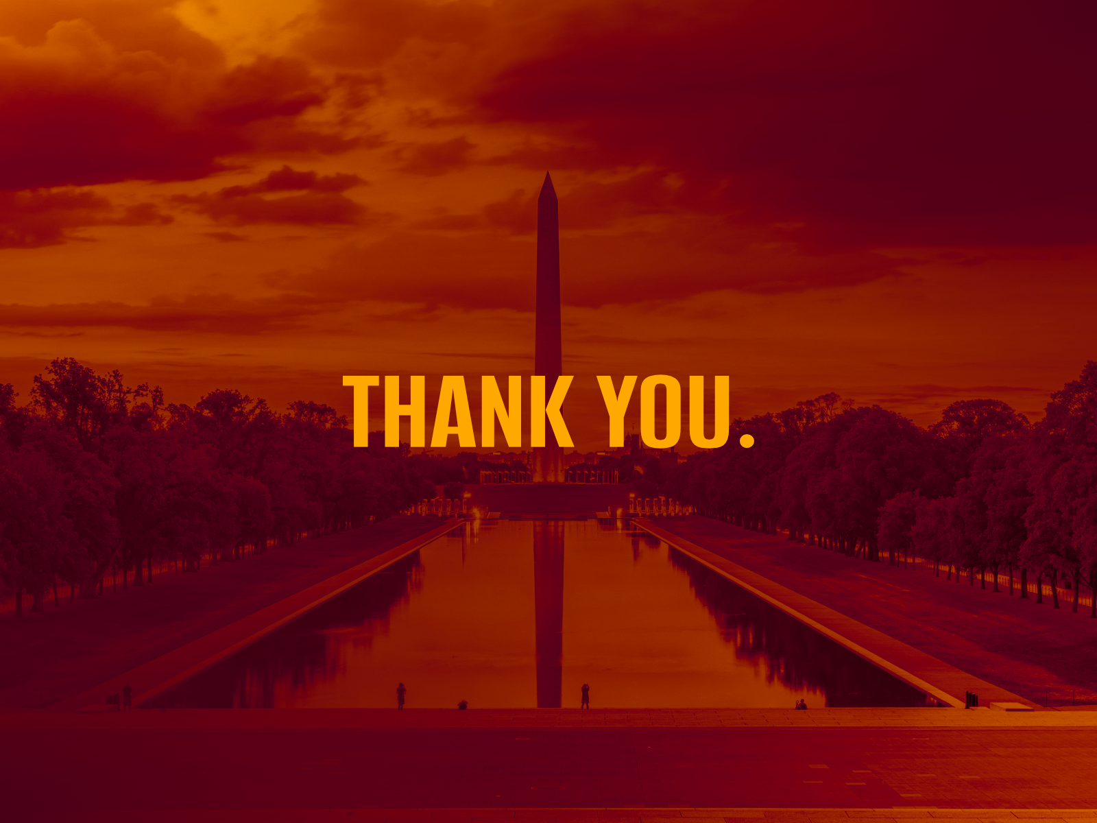
Originally made half for fun and half for a brand design contest with an open prompt, I initially rebranded the Washington Commanders to rectify what I saw as a cluttered mess of a rebrand. After shedding their previous racist moniker, Washington unveiled a haphazardly designed new identity with a nondescript logo, a cluttered badge logo, a mismatched wordmark, and inconsistent, overdesigned uniforms. This new identity did not seem to live up to such a storied city and franchise.
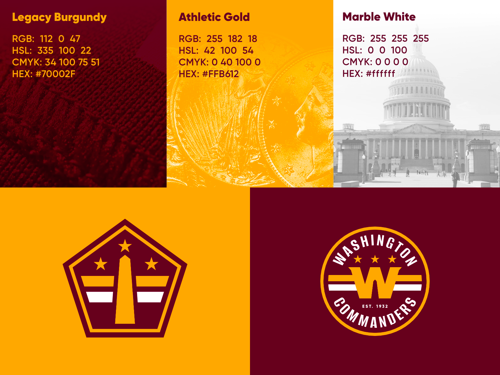
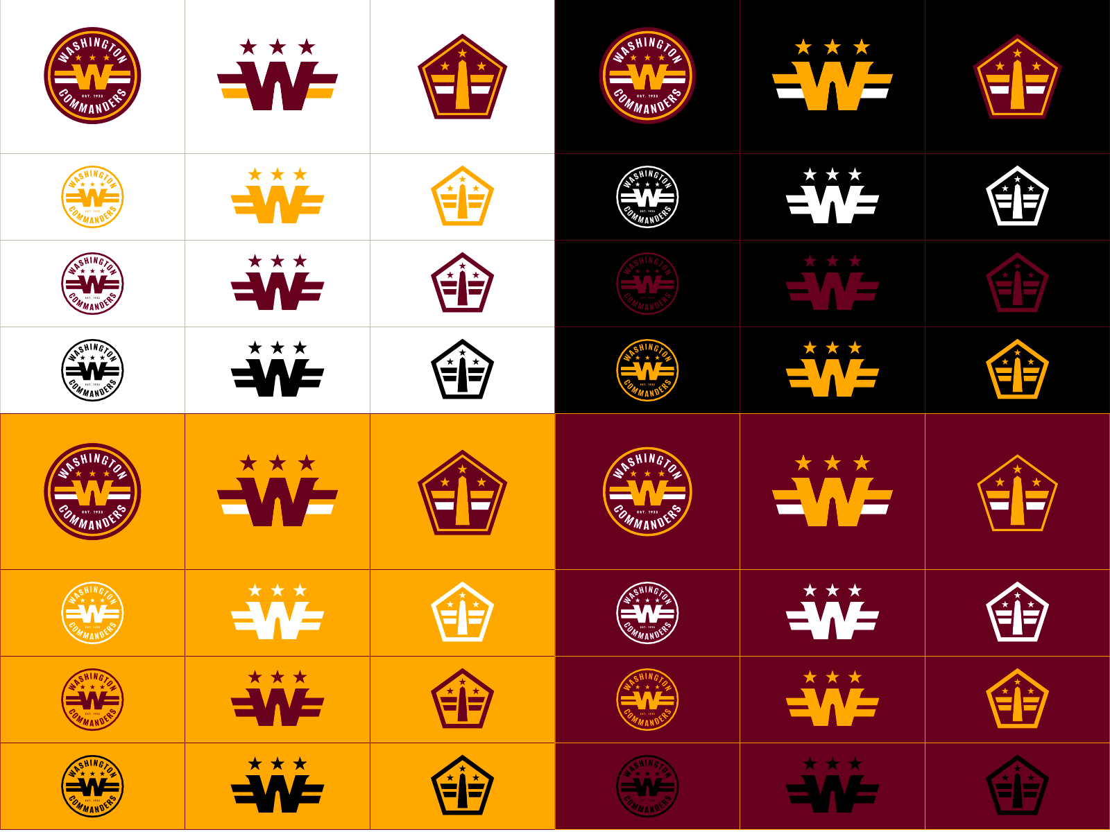
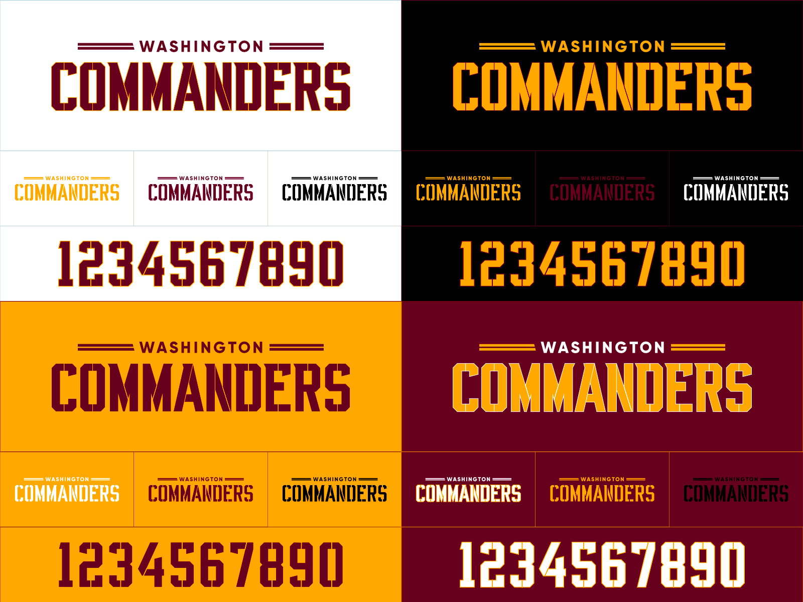
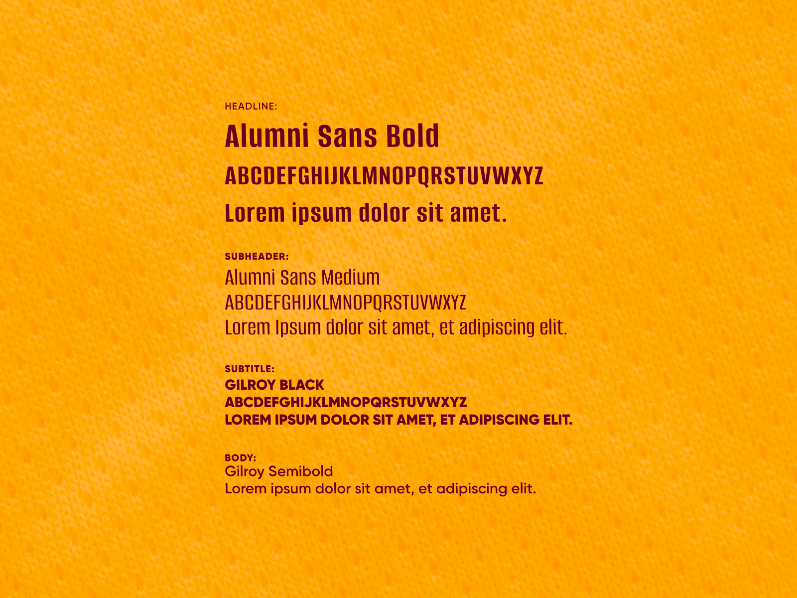
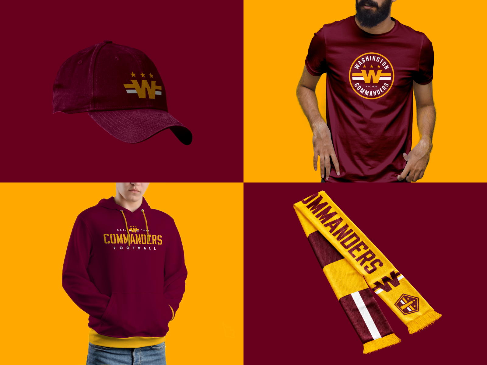
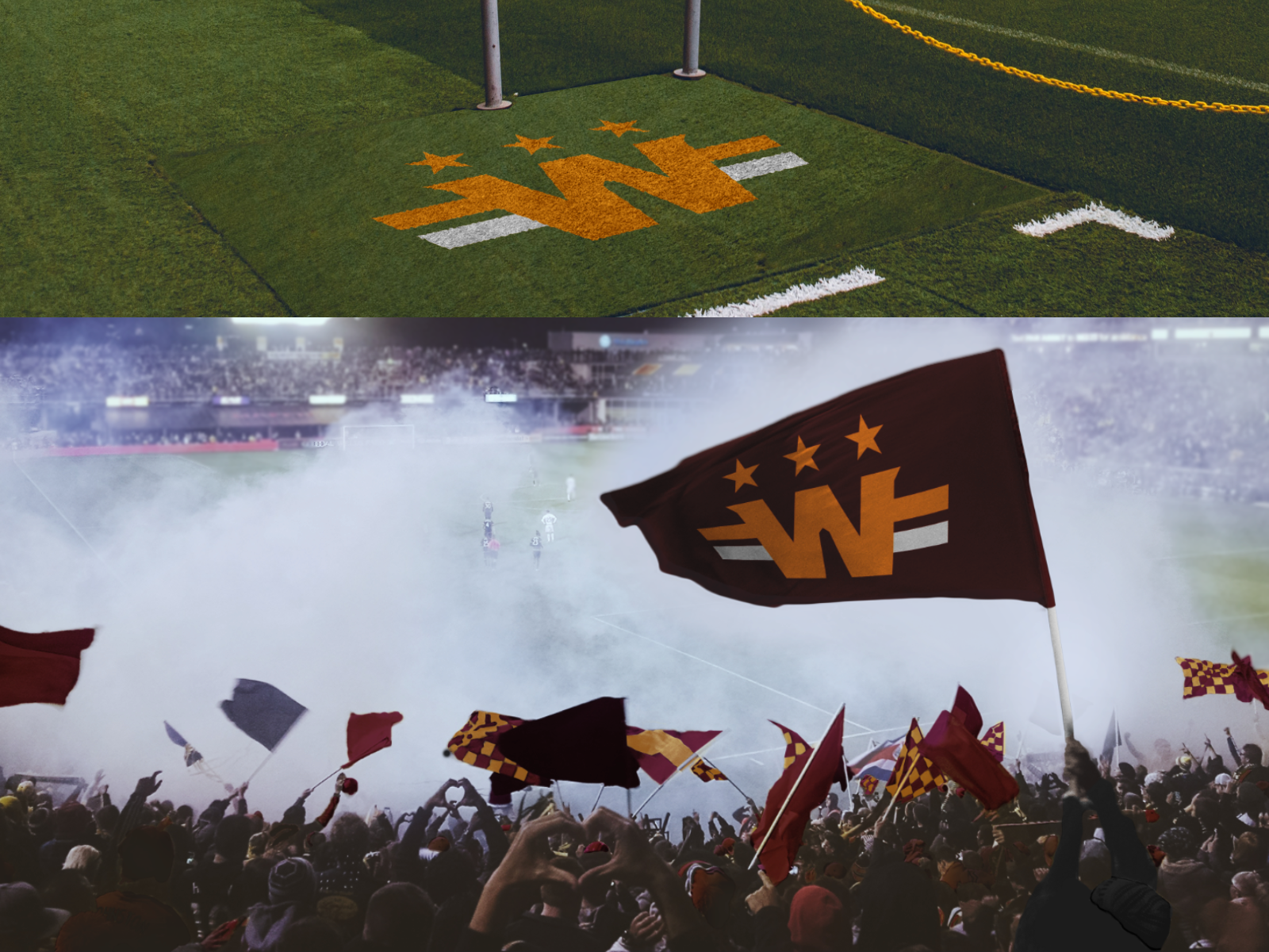
Aspects of the brand–most notably the inspiration behind it–offered interesting opportunities for a redesign. I sought to flesh out the more interesting parts of the identity, infuse it with more DC flair, standardize the visual language throughout the brand, and reign in the uniforms to yield an identity more consistent and befitting of a historical NFL powerhouse.